Thursday, 15 December 2011

Props and Location.

I may take the photo in a forested area, I will be taking photographs of my friend Kieren in corpse paint. He will be holding a rams skull, and it will be dark illuminated by flaming medieval torches.
 corpse paint.
There are obvious risks needing to be assessed, the torches will be kept at least a meter away from the model at all times, and water will be kept close to hand at all times.

Kieren Barr
This is my model for the photographs, he has agreed to meet in Malvern to photos on the 16th January.

Friday, 9 December 2011

Logo Design

For the logo I am going to draw up a logo similar to that of a black metal band.

Examples:


Thursday, 8 December 2011

Target Audience

My target audience will be people of all genders and ages, who love extreme and alternative music. By alternative I don't mean indie bands who play really dull rock music. To clarify I mean things like post black metal, dark ambient, noise music and other progressive artistic genres.The age range will be more aimed at the young adult and adult audiences rather than children though, as a lot of the topics addressed by such bands include adult themes such as violence, misanthropy and self abuse.However some topics are more socially acceptable, like nature, heathenism and more beautiful melancholy rather than the hate and depression expressed by more anti cultural bands. The target audience cannot realistically be defined by a JICNAR scale, or psychographics as metal and especially the more extreme and obscure forms are a culture in themselves and are enjoyed by people from all backgrounds and of all ages. My audience is going to be particularly interested in the meanings and creative process of the songs and production. They are people who are interested in music primarily and a scene or youth culture secondarily, after all the fusion of jazz, black metal, ambient and folk doesn't really appeal to people specifically interested in any of the particular social groups, but rather a more independent open minded kind of listener.


Friday, 2 December 2011

Main Task: Research and Planning

  Existing magazines:


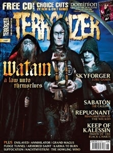
Terrorizer magazine is one of the more alternative metal magazines, focusing on some more extreme metal bands, and less well known acts. The look is pretty dark, using a for of death metal logo style text for the masthead. They make frequent use of WoB and almost always use a bleed effect for the front cover. Terroriser predominantly focuses on some of the more extreme bands in the genre, however it takes quite a light hearted approach and relishes in some of the stereotypes of the genre.


Metal Hammer is one of the more mainstream offerings in the metal industry they tend towards covering the  more mainstream bands. The imagery is pretty similar though, the use of WoB and bleeds are very common, and the masthead is very much like that of a classic heavy metal band.


Zero Tolerance is the most underground of the popular metal magazines, focusing mainly on some of the most extreme and also more alternative artists like black metal, post black metal, dark ambient, and noise music. The cover page is a lot more subtle than that of the other two, the simpler style of text is very apparent, and not so stereotypically "metal". However bleeds are still popular, and WoB is still frequently used. I prefer this more alternative approach to the music as it tends to present metal music as more of an art form and a lifestyle than just popular culture. It stays true to the rejection of popular culture that extreme music has come to personify, and in a sense even reflects the counter culture attitude of some of the heavier sub genres like black metal.

Monday, 17 October 2011

Evaluation, Question 4

The modern digital technology will have made it much easier to make a professional looking front cover, as the professional software is much easier to get hold of and more readily available to the general public than the older analogue equipment. To do this project we used technology's such as:

  • Digital SLR cameras 
  • Photoshop
  • InDesign
  • Internet sites such as Google and wikipedia.
They were useful as they made it possible to do things such as touch up the flaws in the photographs, move the text behind certain areas of the photo, and gather information such as barcodes from the internet.


Blogging helped to keep track of things as it meant I could easily look back and review work I had already done such as the planning, and also the finished product for this evaluation.


Although the technology was useful some aspects of Photoshop such as the "Magnetic lasso" were confusing and frustrating to get used to. All in all though the technology made life a lot easier. 

Evaluation, Question 3

For the front page we used a model, of roughly the age of our target audience, as this would connote some kind of solidarity and encourage college age students that the magazine is specifically made for people of their age. The text we used in the masthead is a combination of a typical American college style text, and a more refined and elegant calligraphy, this connotes both an air of the more sports oriented "jock" style of the american college as well as a more academic and refined artistic approach. This was designed to attract all members of a college based audience. We tried to make the cover stories attractive to people of that age range while at the same time making the main story some what academic to retain the purpose of the magazine.

Evaluation, Question 2

The reader of our student magazine can be defined by: 


  • Taking A-levels.
  • Age 16-20
  • Learning to drive or new driver.
  • Looking for a part time job.
  • Thinking about career/university.
  • Aspirers, radicals and achievers.
  • C1/B JICNAR (parents)
  • BBC 6 or NME listener
  • Plays a musical instrument
  • Casual video gamer
  • Gets drunk occasionally

Sunday, 16 October 2011

Evaluation, Question one.

Our text uses several features that we discovered in the research phase of our preliminary project. For example we drew influences from "College" magazine when deciding how to present our masthead, and decided to use the name "College Daze" as it made it clear what the magazine was about and at the same time created a mordern fashionable attitude by using the word "Daze" instead of days. We also decided to alternate sides with the stories on the cover as opposed to aligning them specifically to one side or the other. The Magazine for "Beloit" Influenced our decision to use a lot of saturated colours and white, as this connotes sophistication and gives the magazine an upmarket feel to it. However we also decided that it would be a better idea to use mostly sans serif fonts, as this is what most magazines use, and also it creates a less formal and more relaxed atmosphere, that students and young people would prefer.