What i learnt
View more PowerPoint from ReubenPearce
 My front cover and the majority of the photography in the magazine makes use of a convention of the popular media of the black metal genre, in the fact I used black and white for the majority of the photography, along with high contrast and low brightness for really crisp shades of black and white. This was inspired by the album art of many black metal bands, notably Darkthrone.
 The writing style is also that of a pretty conventional metal magazine, typically using very theatrical description. For example, "Our interview draws to a close. Harsh electronics from Ulver's opening act drift backstage to the windowless, blood crimson room in which we sit." Quote from Zero Tolerance magazine, and now one from mine "The opening riff drips with reverb, dragged up through the fog itself to haunt your ears and mind and is set on top of the ambience of a windtorn forest. The rustling of trees slowly gives way to the guitar, and finally the melancholic swell of distant strings."
.jpg)
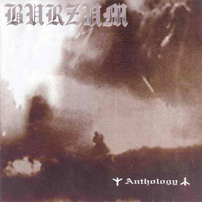 The fonts used are common in the genre, the medieval feel is a well cherished tradition of the metal genre. For example the logo's of more obscure bands like Burzum, and even the bigger more traditional bands like Saxon or Black Sabbath.


